Droplets Pre-mortem
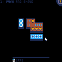
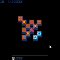
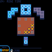
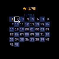
Droplets is a project I've been working on for a month and have been rolling around in my head for months before that.
I wanted to get some of my thoughts out of my head about the design, tools and my feelings about the game - please excuse the rambling!
Inspired by Tash Kalar
Tash Kalar is a boardgame by Vlaada Chvátil in which two players imbue the surface of an ancient arena with their energy and summon forth great figures and begins of legend - which translates to, players place stones on a board to form patterns, and can play cards showing those patterns to upgrade pieces, move them around, place additional pieces etc.
This is all in service of fulfilling a limited pool of objectives - for example, destroying or surrounding opponent pieces, having pieces on particular spaces, or making continuous lines across the board.
Tash Kalar includes many different card summons, each with their own patterns and text describing their unique effects. The boardgame minimizes info overload by only giving a player access to five cards at once.
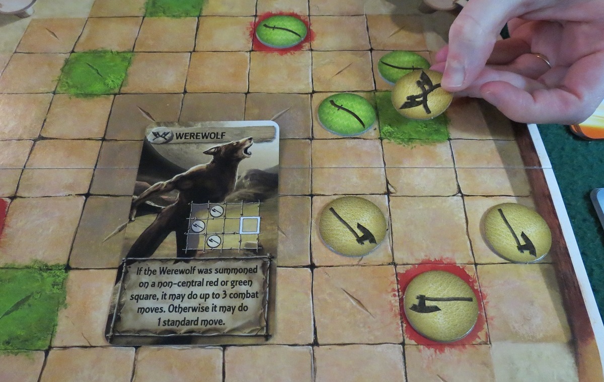
This game has long been a favourite game of mine - the spatial puzzle and potential for exciting combos very much appeals.
Individual turns can often feel like an optimization puzzle - is there some combination of pieces placements and summons that let me eke out just enough stones to grab the corner connection objective? The opponent is going to grab x objective and trigger the end - is there anything I can do to prevent that while still making forward progress?
I've been wondering about how to simulate the mechanics for a purer puzzle game and settled on the following:
- I wanted summons, but I didn't want to overwhelm a player with text and new unique abilities with each new puzzle.
- Instead I decided to have just a small pool of summons with a simple understandable moveset and summoning patterns that could be variable.
- In Tash Kalar, placing a stone takes up half of your turn. Initially each puzzle was going to provide a certain number of stones and the selection of cards to play, but this evolved into summoning patterns that added, removed or pushed droplets around to add more interest and puzzle potential to making formations of droplets.
Game and puzzle design
I largely had a full list of mechanics and features I wanted to include from the start, and worked off a Trello board to keep myself organised.
Having a fairly full picture helped with forward planning and made e.g. implementing the undo system quite breezy.
My main problem was that I didn't have any particularly clear puzzle ideas until most of the mechanics were in place - I designed Spin To Win and Mine Time very early on, which I used as a testing bed for the various mechanics, but all other puzzles were made after all the elements were playable with.
Summons were supposed to be the focus of the game, but due to the linear level progression, I felt it was necessary to introduce the basic interactions and pattern elements first, and the first summon (the move piece) doesn't appear until level 9. Even in this case, you don't actually summon it until much later on (after teaching about summoning regular droplets first with the + pattern).
To an extent, the game feels like a bit of an endless tutorialisation and doesn't quite capture the spirit of Tash Kalar in the way I wanted, with forging specific patterns to summon things. Part of that is my own inability to make and visualise larger-scale puzzles that felt interesting.
As a result of this, I think the game largely suffers from a lack of focus due to trying to introduce new mechanics at a rapid pace, and letting older mechanics fall the wayside a bit.
A few key struggles I had with designing puzzles:
Limited action palette
With each puzzle consisting of just a couple of puzzle elements, it felt easy for puzzles to just devolve into trial-and error or finding an exact sequence to input without feeling interesting.
Summons were intended to be an additional layer to change the game state asynchronously to using patterns to mitigate some of this.
I tried to build puzzles around a key realisation or new mechanic to at least be interesting but I'm not certain I succeeded at entirely avoiding trial-and-error design.
Flip and rotate
Being able to freely flip and rotate patterns made it unpleasantly easy to obfuscate solutions just by rotating or flipping the patterns as presented to the user.
I don't think having to mentally flip/rotate patterns is particularly the interesting part of the design, but to an extent I worried some puzzles would be trivialized if all patterns were displayed in the correct orientation, and also thought some degree of spatial awareness consideration could be an important realisation to make within a puzzle.
I tried to heavily reinforce that flipping/rotating exists early on (particularly in #4 Spin To Win) but tried to avoid maliciously rotating pieces for the sake of it and largely just oriented patterns to be aesthetically pleasing.
Avoiding cheese
If I were to redo this project, I would heavily reconsider many of the mechanics as they gave me many headaches during puzzle design.
Initially, the Mover pieces could only move two spaces. I quickly changed this to three spaces to give them more flexibility to do interesting things. Often during puzzle design I wished they could move fewer or more spaces, or wouldn't leave a droplet behind when they ran out of moves. Due to their flexibility they could easily just walk to targets that I didn't anticipate or push pieces I didn't want them to.
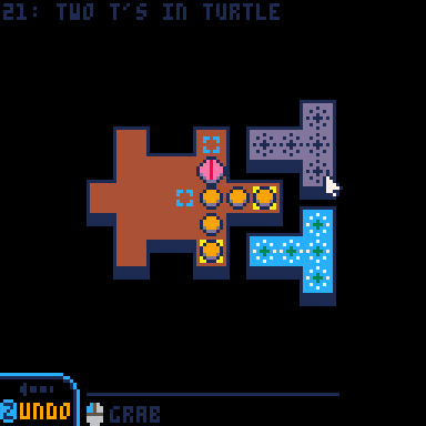
Diagonal movements in general were a consistent pain, with Mover pieces skipping corners or patterns leaning slightly down a corridor I didn't want them to.
Oftentimes, i designed puzzles so that you would need to use summon abilities to get droplets onto goals - but then it turned out you could just place the summons on top of the goals directly and bypass the whole puzzle.
Two friends playtested my levels and I watched them find several unintended solutions in this manner. For some levels I was able to make some tweaks or entire redesigns, but for some others, I felt the 'unintended' solution was just as interesting without skipping any of the intended realisations. The level 'Bouncers' has about five different solutions but both playtests took a short while to reach any of them so I'm happy enough with it.
Negative space
The 'number' goals were a necessary inclusion to force a consideration of 'negative space', i.e. avoiding having droplets in particular positions. I was perhaps a bit too reliant on closing off some spaces with 'zero' goals.
Summon behaviour
I decided that summons should be able to be 'oversummoned' onto existing pieces (as in Tash Kalar) but would probably change this on a redo for simplicity.
I'm not convinced that the Line and Copy summons being 'square' was a worthwhile idea - my main idea was to differentiate the Mover pieces as counting like a regular droplet. I guess it kinda works with the Copy summon only copying circular pieces...
Pico-8
I initially started the project trying to learn some Gamemaker, but ended up falling back on old habits and continued with Pico-8.
Pico-8's integrated environment and a more linear-style of coding just works with my brain a bit easier than Gamemaker's event system - in Gamemaker i had been scrambling my head trying to work out the 'correct way' to do things like, should my mouse be an object? Should each tile on the map be an object that broadcasts a message when the mouse clicks it or something? Should I have a game state object or should each droplet be an object?
Of course, working within Pico-8 provides its own share of challenges and limitations, namely:
Palette and resolution
For symmetry's sake and for fitting larger levels onto screen, I decided droplets and patterns should be 7x7. Initially I envisioned droplets as little puddles of water that would merge together, but the limited resolution provided little scope for adding much personality.
Additionally, there would be a lot of overlapping elements as patterns were grabbed and moved over the level surface and on top of droplets - in the end the colour scheme of orange droplets, brown and blue floors and white/purple arrow patterns was chosen to make patterns as legible as possible. There's still a few palette problems - the red and green +/- patterns are a bit garish against the blue, but my attempts to tweak the designs or colours were not much better.

In claw, I slapped some random circles into the background for visual interest, but in this case I opted to avoid any background detail as a) all my attempts just served as distraction and b) the rest of the assets were already using the darker colours in the palette.
Palette and resolution would be my prime motivators for trying again with a different engine for my next project.
Token limit
The cart is nearly at its token limit.
Due to the way I store levels as list objects, levels currently occupy around 1200/8192 tokens, with each level consuming about 20-40 depending on how many patterns they have. There's doubtless many ways I could have worked to optimise my code and compressed my levels into cart memory etc, but I was pretty happy to have the token count an upper limit on the scale of the game.
Personal Victories
UI design
Droplet is quite a visual game and I knew it would be important to display motion etc to better communicate what is happening. My previous games have had limited animation so this is a huge step forward for me and I'm pretty happy with the UI and animation in general.
Motion is mostly limited to a simple "approach" function that moves the visual coordinates of droplets and other elements 50% closer to their destination, which is enough to quickly and clearly show which direction a droplet was moved. I also used an easing function for level start animations - the bounce might be a bit excessive.
I also had two simple 'falling' animations for droplets and summons which I quite like.
I struggled to make it clear that levels had hints and ended up with a pulsing circle as a subtle way to draw attention.
I'm quite fond of the way the undo/flip buttons slide in when relevant, and how any held pattern will be lifted above the button for visibility while you have your mouse over it.
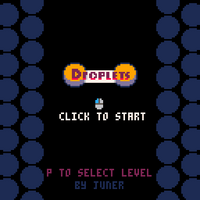
The level select came late on - I could have maybe had a UI element for it but ended up popping it into the pause menu and attempted to remind users about it on the title screen.
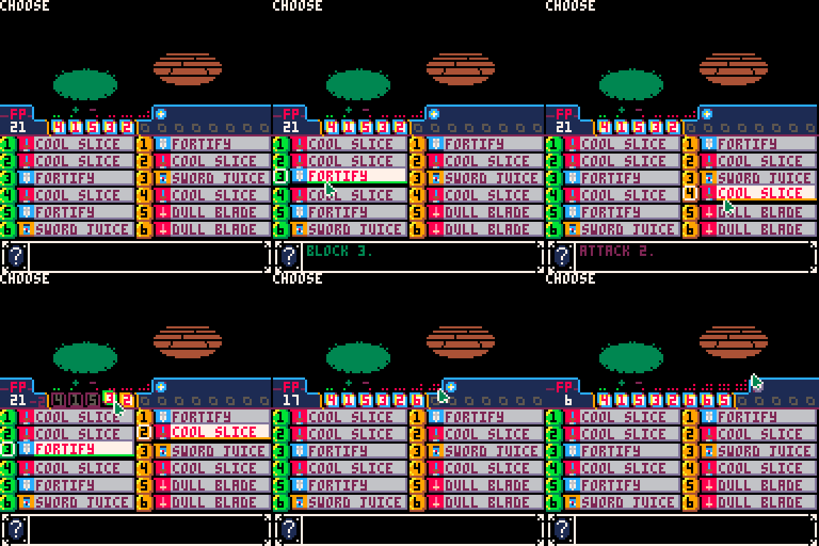
As an aside, I put a lot of work into the UI for a puzzly RPG for GMTK2022 which never got finished, please enjoy a gif:
Diagetic patterns
The patterns themselves were originally intended to be displayed on cards at the bottom of the screen, but due to their different sizes I struggled to make this look appealing, and for smaller levels the cards felt very distant from the rest of the action.
The patterns were already visually laid out next to the levels in the map editor, so I ended up leaning into the idea of having them a natural part of each level's aesthetics.
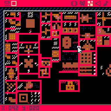
I think this was a good choice, to add flavour to what would otherwise be pretty bland brown level layouts, and to keep all the information together.
I did however find it difficult to not just design for aesthetics and to try and break up boring symmetrical level layouts etc.
Extended project
My previous itch games have all been short gamejam entries.
Due to a gap between jobs, I've been able to work on this one for a considerable period of time over a month.
It's been nice to have the motivation and time to push away at something like this for an extended period of time.
During development, I woke up one morning and checked my emails and was surprised to see my game Claw as featured Thinky Games Club game in their newsletter - a really pleasant start to the day and a big motivator to continue working on Droplets, so thanks to whoever highlighted it! (And a big recommendation to subscribe to their newsletter!)
I've ran out of steam a bit towards the end - as mentioned, I've struggled with puzzle design, and my attempts to compose some music were a bit too much of a struggle. I also suffered with some sleepless nights as I kept trying to continue working on the game in my head while in bed.
I made the decision to push out at this point to give myself a bit of rest and finality.
Summary
I'm not entirely convinced this is a great or interesting game but it's been a great learning experience to work on and I hope someone might get some enjoyment out of it.
Comments
Log in with itch.io to leave a comment.
Hey juner! I love droplets and I really enjoyed reading all these thoughts. I picked up Tash Kalar a couple years ago, I'm a big fan! Also... it just so happens I'm the person who chose Claw to be highlighted in our Thinky Games Club :) really nice to hear that it was an enjoyable surprise and motivating for you.
Let's chat sometime - I feel we have a lot of design sensibilities in common and I'd love the idea of working on a small game together if that sounds appealing to you.
Thanks for reading, and highlighting Claw!
Absolutely down to chat!
[EDIT: Discord name removed]
Thanks for sharing your journey! Really interesting read and a great insight into an indie game developer's life :)
I personally discovered this through Thinkygames newsletter and thoroughly enjoyed it! Time to check out Claw!
Thanks for all the hard work putting this together